
Introduction
With the ever-increasing popularity of mobile shopping — a.k.a. “M-commerce” — your business needs to do everything it can to capitalize on the trend. The best way to take advantage of M-commerce is through creating and maintaining successful mobile product pages.
Detailed below are the critical elements of a successful mobile product page so you can implement them into your M-commerce strategy. You’ll be increasing your online sales and conversion rate in no time!
Creating a successful Mobile Product Page
1. Improve the quality of your images.
Gone are the days when we did all our shopping using a personal computer. Customers now use a wide range of devices to make their purchases, from laptops to tablets to mobile phones. The problem is that different devices have different screen sizes. As a result, you’ll need to optimize all of your images for different devices.
One major factor that determines image quality is file size. If the image is too big, load time will suffer, especially over a data connection. If your load times are slow, customers will leave. As you can see from the graph below, when page load time takes more than three seconds, page views drastically decrease.
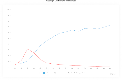
Image files often account for a significant portion of a page’s file size. Reducing image file size can significantly reduce page load times.
Your images still have to be high-quality, so make sure you balance image quality with file size. You can reduce file size while maintaining image quality by compressing your images. The best way to compress images is by using tools such as JPEG Optimizer or Jpeg.io.
Another way to improve image quality is by using tools that store multiple versions of an image on your server. These images are of different sizes. When a user loads your product page, the server can use the best image for the user’s screen size. With this method, you’ll reduce mobile product page load time.
Additionally, you can host images on your website or defer offscreen images from loading. There are plenty of plugins that allow you to defer offscreen images loading. Meanwhile, a content management system (CMS) such as WordPress gives you the option of hosting images on its servers. Either approach can reduce page load time.
2. Keep your text brief and to the point.
Ensuring the copy on your mobile product pages is succinct is vital. No one wants to read dense paragraphs of information on a tiny screen. Here’s an example mobile product page from Reebok to show you how it’s done:
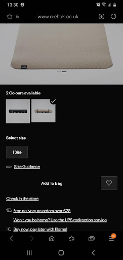 The copy on this page conveys only the essential details. If the customer wants more information, they can expand the highlighted text for further information.
Writing concise copy such as this results in a clean layout with only the most important information displayed. It works well on mobile and provides a great customer experience.
3. Make your product page swipe and zoom responsive.
You’ll also need to make navigating your mobile product pages easy for the customer. Poor navigation systems will put off potential customers, causing you to lose sales.
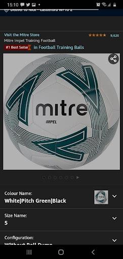
Also, according to Baymard, over 40% of US e-commerce sites fail to support zoom and other image gestures. The upshot is that incorporating swipe and zoom features can help you stay ahead of your competition. Here’s a swipe and zoom responsive product page from Samsung as an example:
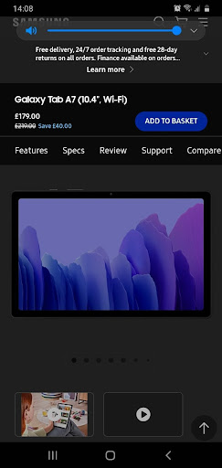
Users can zoom in on images and text and swipe through the image gallery easily. Also, the “dot” image system means the user can see how many images there are.
Incorporating these swipe and zoom features makes navigation easy for customers, giving them a better mobile experience.
4. Make clever use of product reviews on your mobile product page.
Why use product reviews? Simply stated, they reassure the customer of your product quality and value. Product reviews can also reassure the customer you will ship the product on time and give good customer service if something goes wrong.
Making clever use of product reviews increases customer trust in your brand as well. Invesp found that 88% of customers trust product reviews as much as personal recommendations. If customers trust your brand, they’re more likely to make a purchase.
But how do you make clever use of product reviews in a mobile-friendly way? One way to do it is by only displaying the star rating.
By only including the star rating, you reduce the space used while giving an overview of the product rating. If the customer wishes, they can expand the star rating to get more detailed product reviews.
Including the number of reviews next to the star rating (as shown in the example above) is also a good idea. It helps reassure the customer that the star rating holds weight and doesn’t take up too much space. Just make sure you consider the placement of the review. A good place is next to your call to action to help inspire purchases on your mobile product page.
5. Save data automatically.
Abandoned carts are very common in the world of M-commerce. Barilliance found that carts are abandoned at a rate of 85.65% on mobile, compared to 80.74% on tablet and 73.07% on desktop.
This is often intentional. Sometimes, though, carts are abandoned due to connectivity issues or other factors. To rescue these sales, it’s essential to save data from user sessions. When data is saved, the user can return to find the product in their basket. They are then more likely to make a purchase.
You can increase the chances of a customer making a purchase when they return by offering a discount. There are a few ways to offer a discount, including the use of pop-ups.
You can also send follow-up emails reminding the customer that their basket was abandoned. It can help to offer a discount at the same time. Using sales automation tools is useful for this. But having a seamless mobile checkout by saving data should be a top priority.
6. Check that the “Add to Cart” button is visible above the fold.
If you make purchases easy for your customers, your product pages are more likely to convert. One way to make purchases easy for the customer is by placing the “Add to Cart” button above the fold. Here’s how Gucci places their “Add to Cart” button:
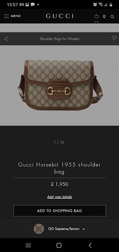
Placing the “Add to Cart” button above the fold encourages the customer to take action. The customer doesn’t have to scroll. The button is clearly visible. As a result, they are more likely to purchase. Use this example as a guide when adding a buy button to your mobile product page.
7. Provide recommendations.
It’s a good idea to add upsell and cross-selling opportunities to your mobile product page. The best way to do this is by recommending similar products. A good example would be a customer looking at golf clubs being recommended golf balls or golf gloves.
However, make sure you don’t overwhelm the customer and detract from the main product. Recommendations should supplement the mobile product page for the best results. Here’s an example from a Dell laptop product page.
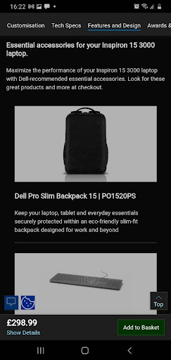
The product recommendation in this case is a backpack designed to carry a laptop. It’s a good recommendation as it’s relevant to the product and supplements it. It also doesn’t overwhelm the main product. Follow this example to create great product recommendations that will boost sales of additional products.
Quick Summary and Conclusions
To create a great mobile product page, you need to be concise with language and make the most of the small screen size. All the important information should be on the first page; don’t make your customers scroll! Easy navigation is also key, especially image navigation.
Your images need to be high quality and optimized for mobile. Copy should be brief and to the point. Try to convey a lot of information with few words. If your customer abandons their cart, you’ll want to save their data. That way, you can restore their basket when they return.
Clever use of product reviews helps your customers trust you and helps with conversions. As a result, make sure you include them in a mobile-friendly way. Your mobile product page also needs to be easy to navigate. Ensure your page is swipe and zoom responsive.
Another important thing to remember is the “Add to Cart” button placement. It needs to be above the fold to promote sales.
If you combine all these tips, you can create a successful mobile product page in no time. But make sure you don’t overdo it. Very often, less is more. The aim is to make the customer journey as easy as possible to encourage sales.